observation: Gap's missed opportunity
Almost Brave
When a moment for meaning was mistaken for a logo update


When the “why” is unclear, even the boldest changes feel empty.
Gap didn’t lack recognition.
It lacked clarity.
While many brands assume that change alone signals progress, Gap mistook motion for meaning. It altered its appearance without articulating its intent. It adjusted the surface without addressing the core. It assumed the audience would understand why—without ever saying it.
That decision—made quickly and reversed just as fast—wasn’t about design.
It was about conviction.
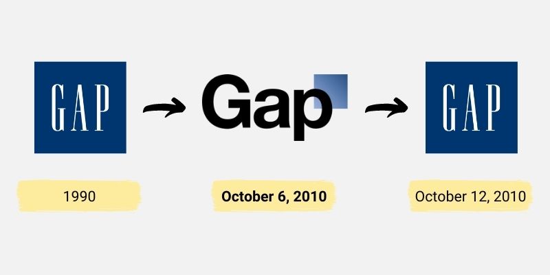
Gap’s 2010 rebrand didn’t fail because a logo missed the mark. It faltered because the brand never committed to a reason for changing at all—and without a clear why, even the boldest moves feel uncertain.
The Moment They Had
When Gap announced a rebrand, it created permission.
Rebrands are rare moments when an audience leans in. They signal that something deeper may be happening—that a brand has reflected, decided, and is ready to say something new about itself.
This was Gap’s opportunity to articulate a point of view:
about modern American style
about accessibility
about relevance across generations
It wasn’t just a design moment.
It was a meaning moment.
What Actually Happened
The new logo arrived quietly.
It was neutral. Clean. Technically sound. Entirely interchangeable with countless other brands trying to look modern at the same time. There was no narrative attached to it—no belief, no declaration, no reason the audience could grasp onto.
The brand changed its appearance without changing its relationship to the people who loved it.
And without a reason to care, people didn’t.
Why This Was a Missed Opportunity
Too often, brands mistake time for a reason.
“It felt like time for a change.”
“The brand needed a refresh.”
“We wanted to modernize.”
Those aren’t reasons.
They’re symptoms.
Change without purpose creates confusion, not momentum. It signals uncertainty instead of leadership—especially for iconic brands that have earned the right to speak with authority.
Gap didn’t fail because the logo was wrong.
Gap failed because the brand never articulated why the change mattered.
The Quick Reversal—and What It Revealed
When the backlash came, Gap reversed course almost immediately.
The speed of that reversal mattered.
Instead of reframing the conversation or clarifying intent, the brand retreated. What could have been a dialogue became an apology. The audience didn’t learn what Gap stood for—only that the brand wasn’t sure enough to defend its own decision.
That hesitation reinforced the original issue: lack of conviction.
What Was Lost
Gap had something many brands don’t:
trust, familiarity, and generational loyalty.
What it didn’t use was its voice.
The rebrand could have been an opportunity to reconnect—to say, this is who we are now, and here’s why it still matters. Instead, it became a lesson in what happens when design moves faster than belief.
Attention came.
Meaning didn’t follow.
And attention moved on.
What This Reveals (And Why It Matters)
Rebrands don’t fail because of typography or color.
They fail when brands change what they look like without understanding what they stand for.
Marketing’s job is to answer the why.
Advertising’s job is to commit to it publicly.
When those two aren’t aligned, even iconic brands fade into neutrality—no matter how much money is spent.
What Brands Can Learn From This
Change is not a strategy.
Design is not a substitute for clarity.
Before altering a logo, a voice, or a visual system, brands must answer harder questions:
Why now?
What belief is evolving?
What truth are we ready to stand behind?
What would be lost if we didn’t change?
When the why is clear, the rest follows naturally.
When it isn’t, the work feels hollow—no matter how polished it looks.
A Final Thought
Not every brand needs reinvention.
But when change is pursued, it must be anchored in meaning—not motion.
Gap didn’t lack resources, talent, or attention.
It lacked a reason strong enough to carry the change forward.
And that’s the opportunity that slipped away.
Key Takeaways
Change without a clearly articulated why creates confusion, not momentum.
Time alone is not a reason to rebrand.
Design can’t substitute for belief or direction.
Rebrands require narrative, not just visual updates.
Conviction—not consensus—is what carries change forward.
